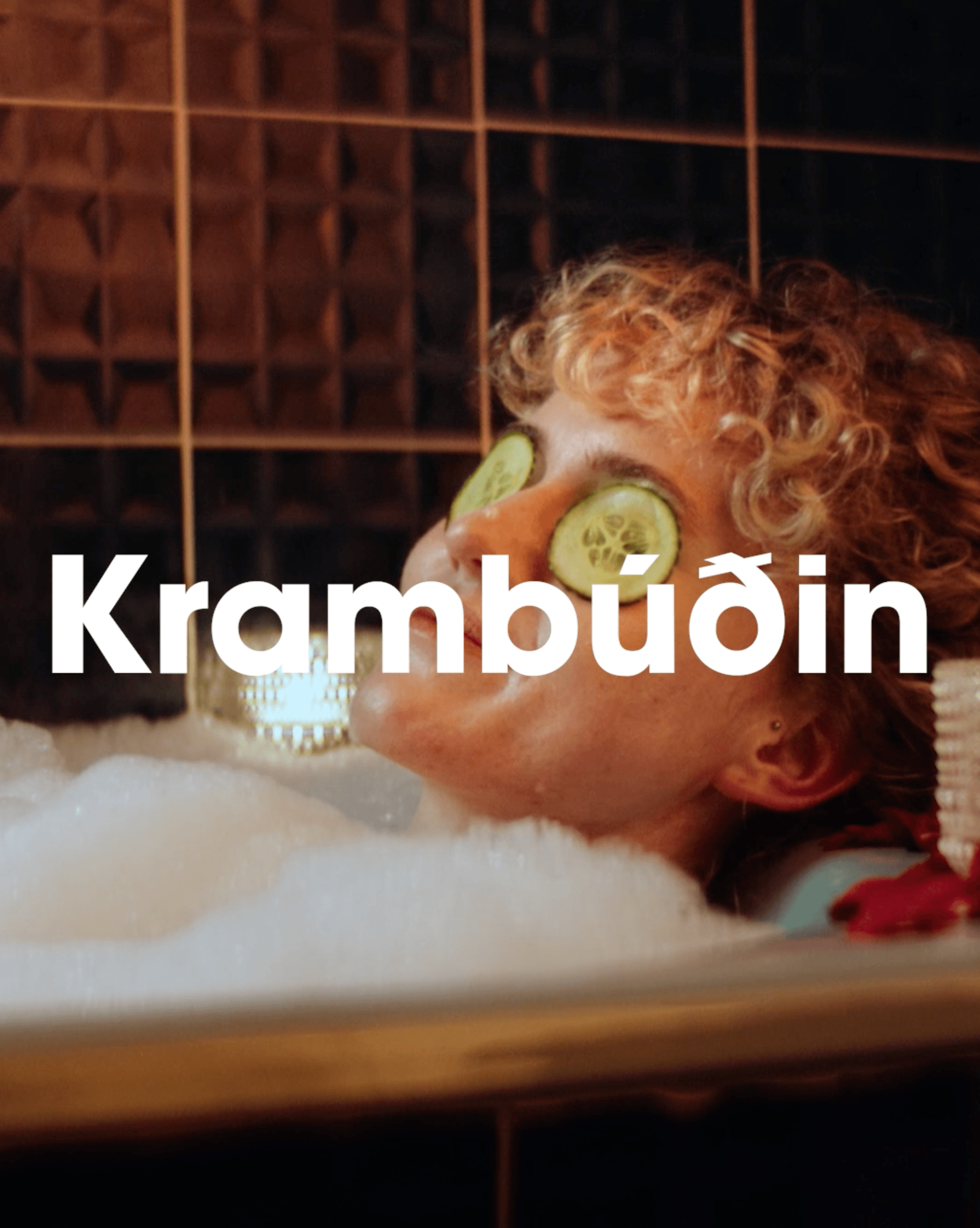
More often than not, Krambúðin
The project:
People shop at Krambúðin for various reasons, but most often, the trips there are made for convenience. We created a communication strategy and produced advertisements that conveyed different stories that capture this reality.
Project outcomes:
Currently being analyzed
Our role:
The analysis
The brand measurement of Krambúðin was conducted by Gallup and showed that Krambúðin had the opportunity to increase awareness and positive disposition towards the brand among the public.
To analyse and seize these opportunities, we started by examining Krambúðin’s marketing content. It quickly became apparent that the public’s perception of Krambúðin and its customers did not align with the store’s image and its management. It was clear that we needed to better understand the needs, desires, and expectations of Krambúðin’s customers. We also needed to find ways to meet these needs and expectations in a way that lined up with Krambúðin’s image and strategy.
To find the common ground that could best appeal to people, we identified four target groups and the reasons behind their visits to Krambúðin. The first group is families with children who run households with a fairly organized weekly shopping in low-price stores, but need just one thing, and they need it now. The second group is single and/or young people who don’t need to do these bulk purchases, are unlikely to have a car, and therefore visit the neighbourhood store more often. The third group is people on the go who want something to eat, and the last group is teenagers and young people in the neighbourhood and nearby schools who buy snacks, sweets, soda, or energy drinks.
What unites these groups and matters most to them are the conveniences offered by the relaxed, dependable shopping experience in Krambúðin. They are likely to think something like this: Although Krambúðin isn’t my first choice when I do bulk shopping, it’s very convenient to have Krambúðin nearby.
The team

Albert
Creative director

Arnar
Designer
The strategy
Honesty is the best tool when building and strengthening a brand. Therefore, the strategy was based on finding ways to speak into customers’ real experiences in a constructive manner, so that our communication would be credible and empathetic. We also shifted the focus from talking about ourselves, i.e., making communication about opening hours or prices, to being curious about the customer; Where are they coming from?
Many stores meet people’s basic requirements and expectations regarding price, product offerings, and opening hours. These conveniences were the main advantage of Krambúðin. Our insight was that people value many things other than money, and the values that Krambúðin conveys to people are essentially always being open, always nearby, and always answering the needs of the moment. This insight became the basis of all the work that followed.
The nature of Krambúðin doesn’t lend itself to taking itself too seriously. The store needs to show the public that it’s aware that it plays a limited role in people’s lives and solving a specific problem. Therefore, the tone in the messages was defined as relaxed, enjoyable, and self-aware – without making fun of itself. Thus, we arrived at the headline of Krambúðin; “More often than not.”
The execution
When the idea of “More often than not” was formed, it led us to the messages we wanted to convey to the public. Variations of the sentence deliver different information with a repeated and consistent tone, strengthening positive emotional connections between the public and the role Krambúðin plays in their lives. The message is easy to adapt to current issues and moments in peoples lives that everyone can relate to.
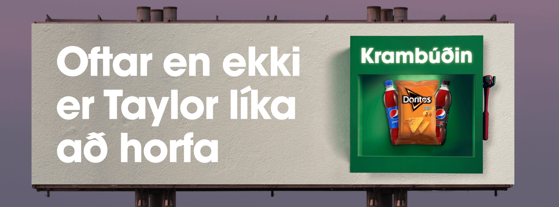
To further enhance the concept, we aimed to visualize it as well. In Krambúðin, you’ll more often than not find precisely what you’re looking for. Hence, the concept emerged of depicting Krambúðin as an emergency box placed outside people’s homes, containing precisely what they need at that moment.
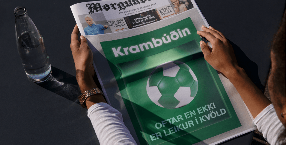
We crafted television commercials with scripts following the same formula: a relatable problem solved by Krambúðin in an unexpected way. Subsequently, these commercials were complemented by outdoor advertisements and web banners that seamlessly blended these two elements: the emergency box concept and the “More often than not” message.
